Tag: Dublin
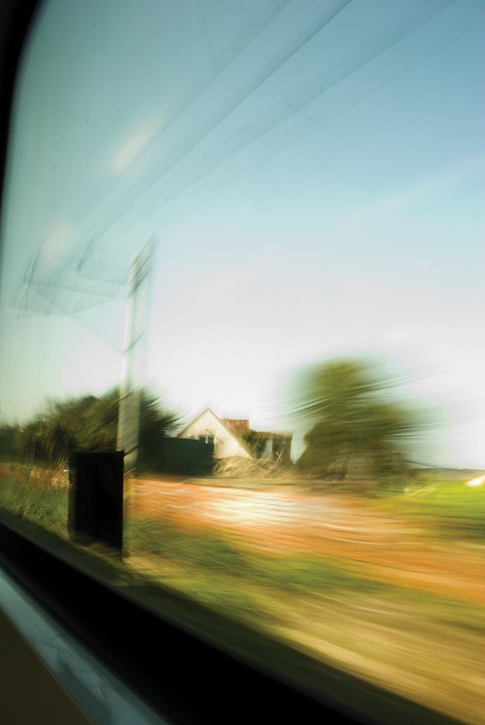
Single shot: Train
Trains in a city make me think of work & commuting, but out in the countryside that same train reminds me of holidays, fun times and sunny day trips out of town.
This shot is from a window of a train in Ireland from a good few years ago. There’s nothing particularly impressive about it — I mean it’s blurry as feck and the subject matter is a bit rubbish, hell I can’t even remember where I was going… but I think that’s the bit I like most about it.
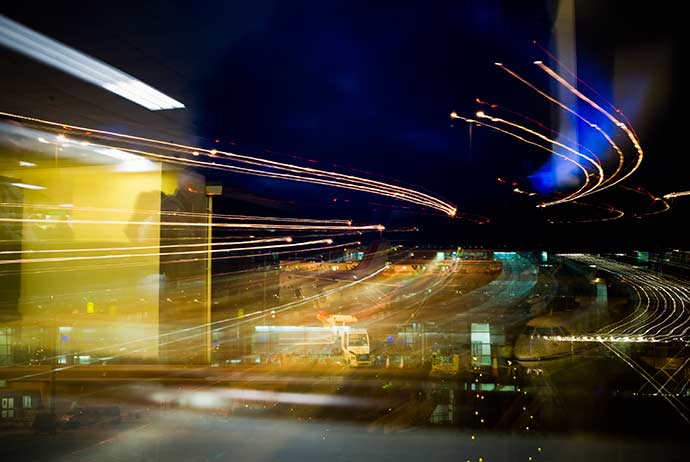
Single shot: Airport
I shot this in Dublin airport while I was waiting to board a flight. Shot through the window in the departure lounge I zoomed the lens over a long exposure time to drag the lights over the scene. Other than some levels it’s pretty much as it was when I took it. I think the blurred lines of light fit in pretty well with the airport.
Offset 2014
There’ll be tonnes of reviews of Offset so rather than share my experience talk by talk I’m going to go through it based on the themes I saw reoccurring throughout the different talks.
I’ve broken it down to six basic themes which I think provided the undercurrent of the weekend.
Play
The idea of work as play (or play as work) and the way it can influence and drive your work was an interesting concept. For both Jessica Walsh and Sarah Illenberger it is a core part of their work. Being experimental and working with their hands is a crucial part of their day-to-day. Far from the über-stylish ‘flat graphics’ which underpin (or undermine — depends on your point of view) contemporary design, their work is bursting with a playful tone that doesn’t feel like it’s been spat out by a robot.
Jessica Walsh’s work for Aizone.

Sarah Illenberger’s genius collection of things made from other things.
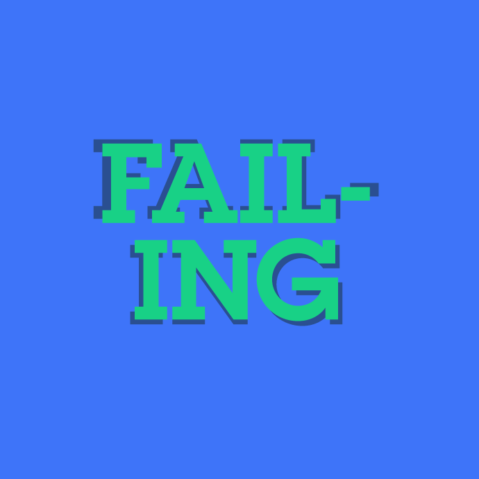
Failing
The positive associations with the term failing are an interesting recent development. Working in a city like London it can feel a bit like living on a hamster wheel and the fear of falling off seems to keep people running forward without knowing where they’re going. I know it’s something I struggle with — the feeling of being unable to fail. It’s not failing to meet deadlines or keep a business sustainable I’m talking about here, they’re a given. It’s more a way of thinking, a way of working. Trying ideas which are unproven and challenging for both the agency and client. More and more I’m realising that it’s the ideas that challenge conventions and reside in the unknown and uncomfortable that generate exciting results.
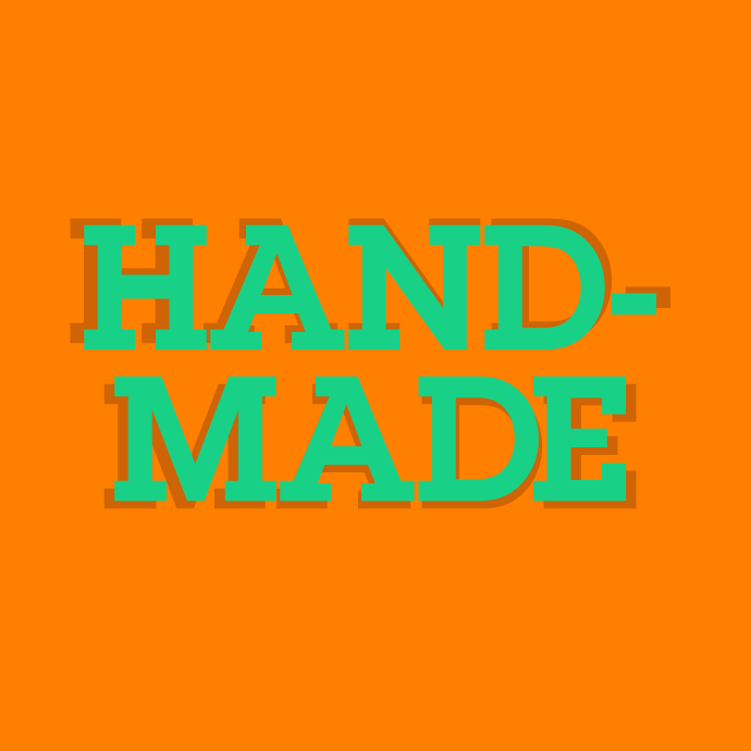
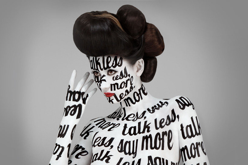
Handmade
This leads nicely to the next theme; handmade. Not in the sense of hand drawn illustration or art but rather in designing with imperfections. It was clear from a number of speakers that the mistakes generated from handmade things were more interesting than the things themselves. In a design culture full of perfectly drawn but impersonal icons, design that isn’t perfect sometimes feels more human.
The intro stings for the speakers were a particularly impressive display of this. Created by M&E a design duo from Ireland & Sweden. They featured handmade type being plunged into ink & water to create psychedelic typographic loveliness.
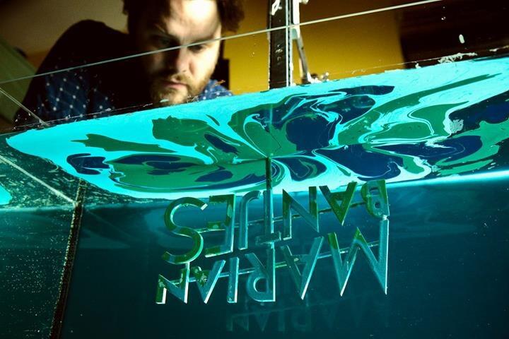
This lovely shot tweeted by Offset shows them being made.
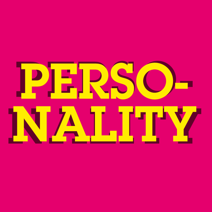
Personality
“F.Y.O.A.V.A.S.W.I.V.L.
Find your own authentic voice and speak with it very loudly”
— Jeff Greenspan
The theme of allowing your personality to invade your work was unsurprisingly evident in nearly every speaker and I guess it’s not much of a shock. The calibre of creative speaking at Offset is huge and this comes not from a standard working formula but from a personal drive and ambition to always be better.
Jeff Greenspan‘s ‘Hipster Trap’ and ‘The World’s Most Exclusive Website’ showed that a great idea doesn’t need massive finances backing it to be realised — just determination. His talk was reminiscent of Ji Lee‘s from Offset 2013 where he showed his personal projects.
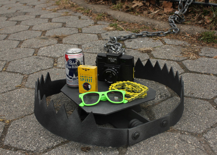
Jeff Greenspan’s ‘Hipster Trap’.
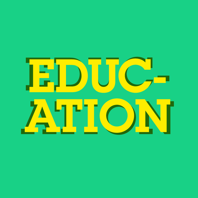
Education
Neville Brody’s talk kicked off a debate about education and who should bear the brunt of the cost. It continued on in his interview with Adrian Shaughnessy straight after. Brody contended that the cost should be born by the design industry itself and that design agencies should be investing in their own future.
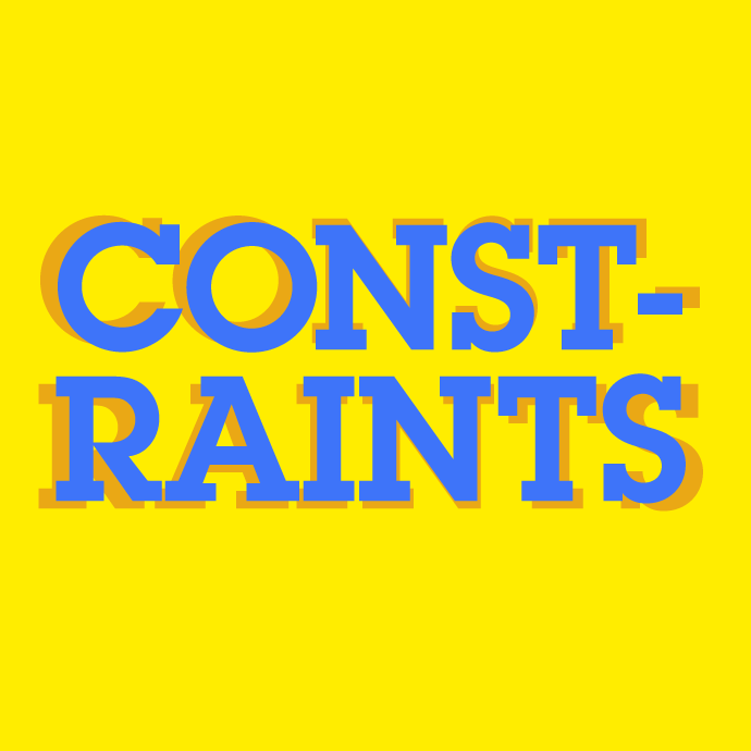
Constraints
The blank page reared it’s ugly head this weekend. What do you do with a completely open brief? Mark Waites from Mother London reckons that if client came with an open brief they’d end up producing nothing. Jessica Walsh makes up her own constraints when approached with more open briefs. I think it’s a fairly universal need for there to be a problem in order to come up with a solution.
Conclusions
Every year there’s a couple of things that I take from Offset. This year I plan to slow down, take more risks, make stuff by hand and be a bit more playful. Which should be fun.
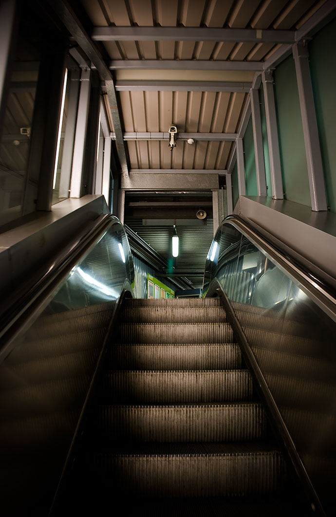
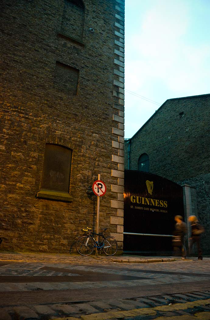
Single shot: The Gate
This one is from a good few years ago now. I think I was at some kind of design event in the Digital Hub in Dublin. It was one of those ones where you spend a whole day just thinking up new, exciting, impossible ideas with a group of people you’ve never met. It was a fun day and I took this just as I was leaving.
This snap had nothing to do with the event but it still reminds me of it for some reason.
Notes on a scandal or two
There’s always been a bit of confusion when it comes to people outside the design profession talking about logos and identities and to be honest it’s probably our own fault. For some reason we tend to find it difficult to explain exactly what it is we do — well, actually I’m sugarcoating it, we’re pretty damn awful at it.
Over the past few weeks there’s been a couple of controversies over identities and their costs that’s brought this to light. What seems to have happened is that an agency was either approached or tenders for a job. They get it, complete it, bill it, get paid and then someone somewhere sees that the work cost (£/€/$) 100K or 50K or something. Then they start kicking up a stink that the logo cost so much and that a good logo can be got for a fiver. Except that that’s where the mix up happens. People think the client got a logo for 100K whereas they got an identity. These are two very different things.
1. A logo is a picture. It is a small, important but not overly important part of a identity.
2. An identity is how the company appears across their media and how they portray themselves. It can include: their strategy; their tone of voice; their name; their look and feel and of course their logo.
3. A brand is the public’s perception of a company’s advertising, marketing and identity.
“[A brand…] It’s the result of what the company does, not the cause of it.”
— Robert Jones, Wolff Olins
If we think of it in terms of a building, a logo is a block — one of many — used to create an identity. The identity in this sense is the physical building and the brand is your emotions and view of the building. An organisation’s identity can be extremely complex and takes time to get right. This is why they cost money. It’s also why they are worth the investment. If you get it right it can be an incredibly powerful asset for your business.
![]()
Take brands such as Coca-Cola, Apple or Nike, they have logos that haven’t changed much (if at all) over time but they have invested heavily in their identities and branding. When you think of Nike’s brand you don’t think of a swoosh, you think of a lifestyle – the same goes for Apple. So when someone gets all up in arms about the cost of a logo (when they mean an identity), I can understand where they are coming from but they might not know the whole story.
Two examples of this happening lately are the Irish Water and the Amsterdam city identities.
The Irish Water identity was designed by Zero-G, a Dublin-based company with a portfolio of identities for large and complex companies and organisations within Ireland and abroad including; Bord Gáis, The Science Gallery & The Abbey Theatre. Who better, you might ask, than them to tackle the job? Well actually, they were a great choice for the job and their fee (reported as being €20,000) seems very reasonable. Their fee was for the identity after all, not the logo.
“20K for a logo, sure that’s 5K per word!”
Everyone who was lambasting it picked up on one thing, the logo cost €20,000. Except it didn’t. That was the cost for an entire identity, the logo is merely one part of the identity, and one of the least complicated at that.
That’s where the USI and others who reported on it got it wrong. They reported that 20K for a logo was ridiculous and that the money could be better spent elsewhere. They even wrote an open letter and presented a logo they got through a crowd sourcing website for less than a fiver. A cost they deemed reasonable. They later apologised after two students from DIT wrote them this well-worded response.
Across in Amsterdam Edenspiekermann updated the city’s identity. They too received a lot of criticism over their costs. You can read a great blog post they wrote pointing out that it wasn’t just a logo here. It’s great to see them standing up for the work they have done and justifying the costs. These kinds of jobs are extremely complex and take months of work to complete, all of which adds to their cost. But when they are done right they can be a prudent and worthwhile investment.
So if you take anything from this it’s that a logo isn’t an identity.